Microsoft Weather Web Air Quality Map
Air Quality Map | Card Design | Interaction Design
Please note that all information in this case study, unless stated, is my own and does not necessarily reflect the views of Microsoft. And this project is launched now, you can click here: Microsoft Weather Air Quality Map
Overview
The Air Quality Index (AQI) measures air quality in a specific location, with higher AQI values indicating greater levels of pollution and associated health risks. Our goal was to integrate air quality data directly into the homepage of the Microsoft Weather Website, providing users with a clickable entry that leads to a detailed second page featuring the interactive air quality map.
My role
As the sole UX Designer for the Air Quality Map project, I led the design of key features, including the map layer, information cards, timeline, and responsive layouts for both bright and dark modes. I focused on interaction design, information hierarchy, and ensuring a seamless user experience.
Collaborating cross-functionally with product management, engineering, and data analytics teams, I incorporated insights from user testing and internal launch feedback to drive iterative improvements.
Design Goal
The goal of this project was to enhance the Microsoft Weather website by introducing an air quality layer to the map mode, complementing existing layers such as wind, precipitation, and radar.
Understand requirements
Collaborate with cross-functional teams
This is a new map layer, all work of visual and interaction about the cards and map needs to be explored. At the same time, we received some feedback from users about the design of timeline in other layers and I was assigned the task to redesign the timeline for all layers. So before starting the design work, I had conversations with cross-functional teams including the product manager, researcher, and developer to understand these requirements.
In addition, I showed my sketches to the developer team and talked about the technical feasibilities of my design. That conversation was very important since they gave me some useful advice and reminded me of many edge situations such as how to show the station name on Air Quality Card when the name is too long.
Design process
Timeline exploration
As shown below, based on user feedback and PM's requirements document, I have done a lot of exploration on the vision and function of the timeline. In the end, we chose Design Direction 1 (for hourly mode) and Design Direction 3 (for daily mode). That’s because we used similar visual factors (rectangle with rounded corners) in other places on the same page, which makes the whole page looks uniform.
Air Quality Card Design
I designed bright mode and dark mode cards. Each mode has six air quality degrees (Good, Moderate, Unhealthy for Sensitive Groups, Unhealthy, Very Unhealthy, Hazardous), all the colors for the degrees from the US air quality standard.
Prototype
This project is launched now, you can click here: Microsoft Weather Air Quality Map
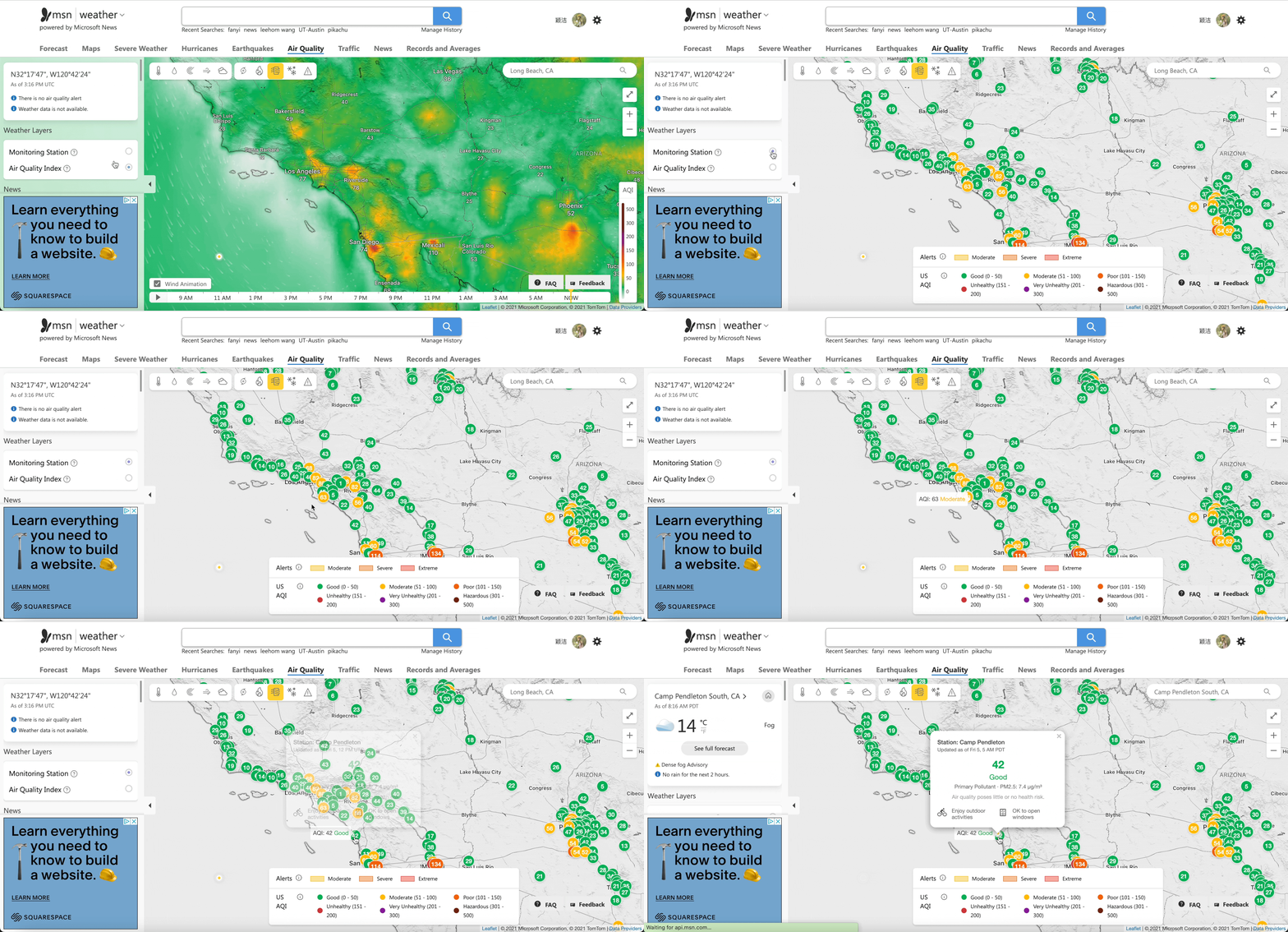
Enter the air quality layer from the home page.
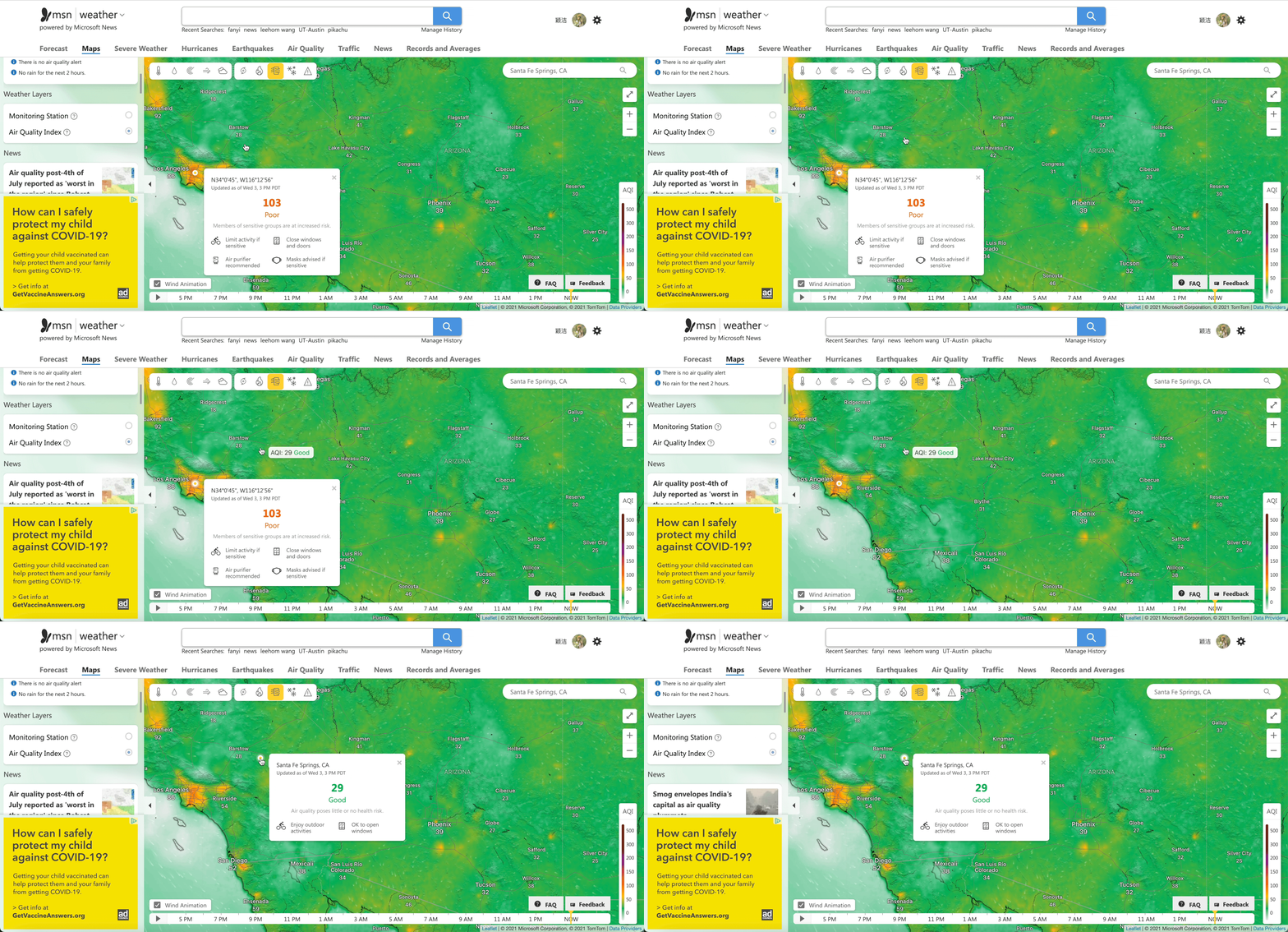
2. Hover to view data, click to view cards
3. Switch to weather monitoring station layer
4. Click play button on timeline
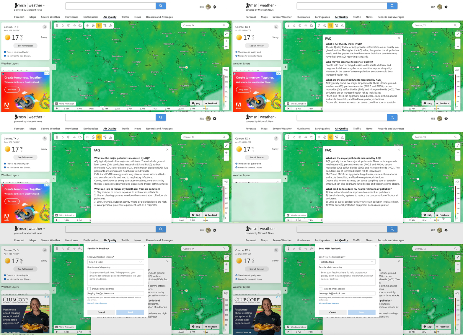
5. FAQ and Feedback
Mobile Version
Impact
🎓 What I learned
Talk with cross-functional teams before design. We can get some useful information from product managers, researchers, developers. It’s a good opportunity for designers to have a deep understanding of users and the product. In this project, I had a conversation with cross-functional teams and showed them my design draft, they did give me some good insights and suggestions.
Pay attention to design details. One big difference between web and mobile interface design is that web design may have more statuses, such as hover, click, and selected. As designers, we should consider all situations as much as possible, which can improve the user experience.
Don't forget the boundary conditions. During the design process, developers reminded me of many boundary conditions, such as where the card should be displayed when the clicked site is not in the center of the site; how to show the station name on Air Quality Card when the name is too long.


